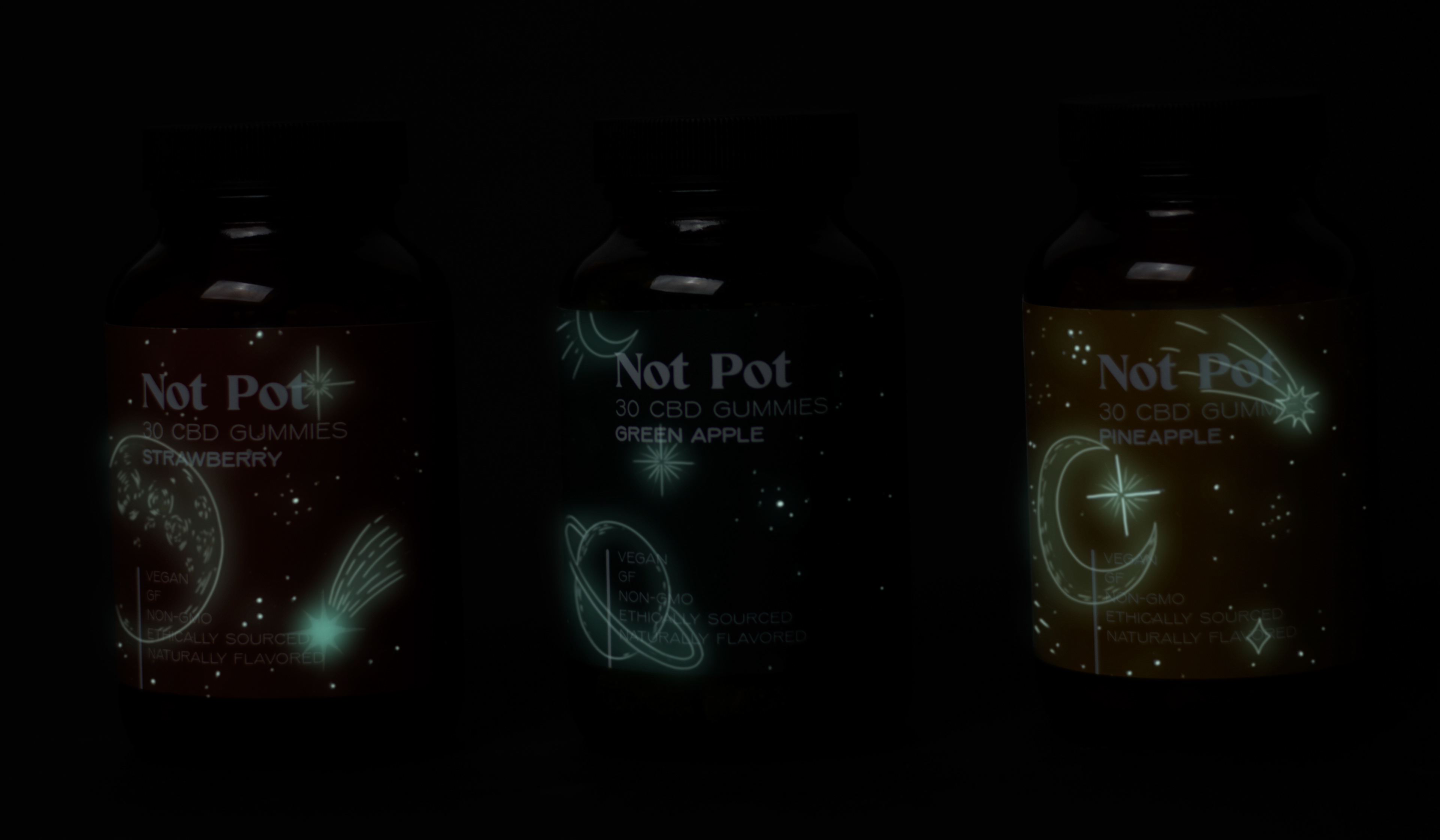
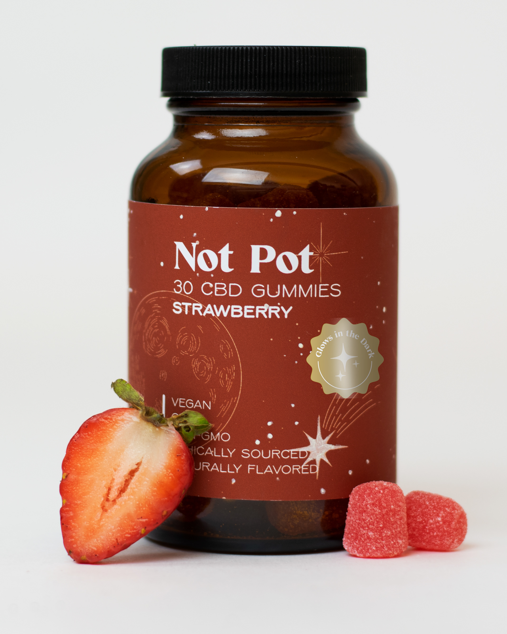
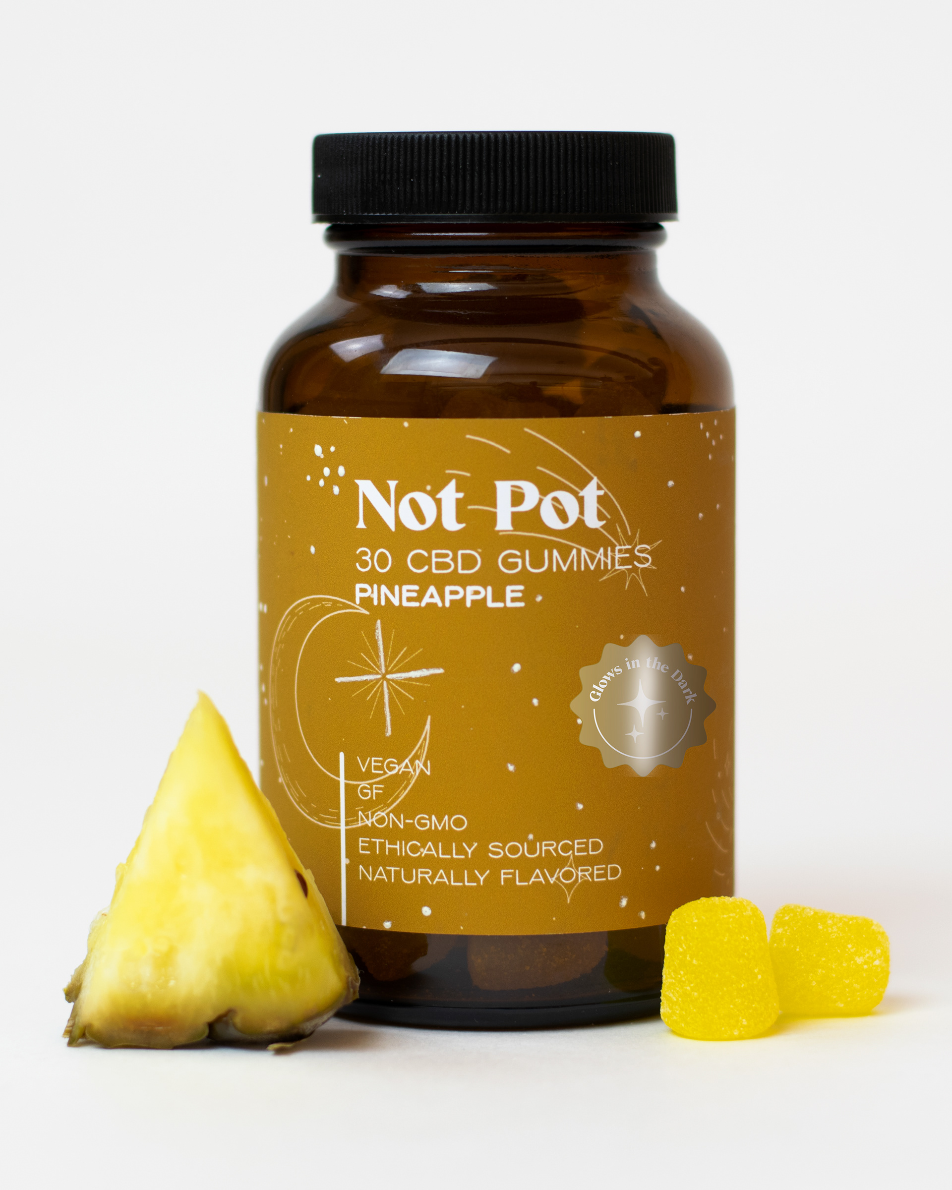
This project was a packaging redesign for Not Pot CBD Gummies. The goal of this design was to make a more age appropriate look for the packaging as the original brand had a more childish look, while also including some aspect of fun for the consumer. for this reason a more modern looking design was created, the design incorporates celestial illustrations to harken back to the main use of the product, which is relaxation. These illustrations glow in the dark on the bottle to add a fun interactive aspect for the consumer.
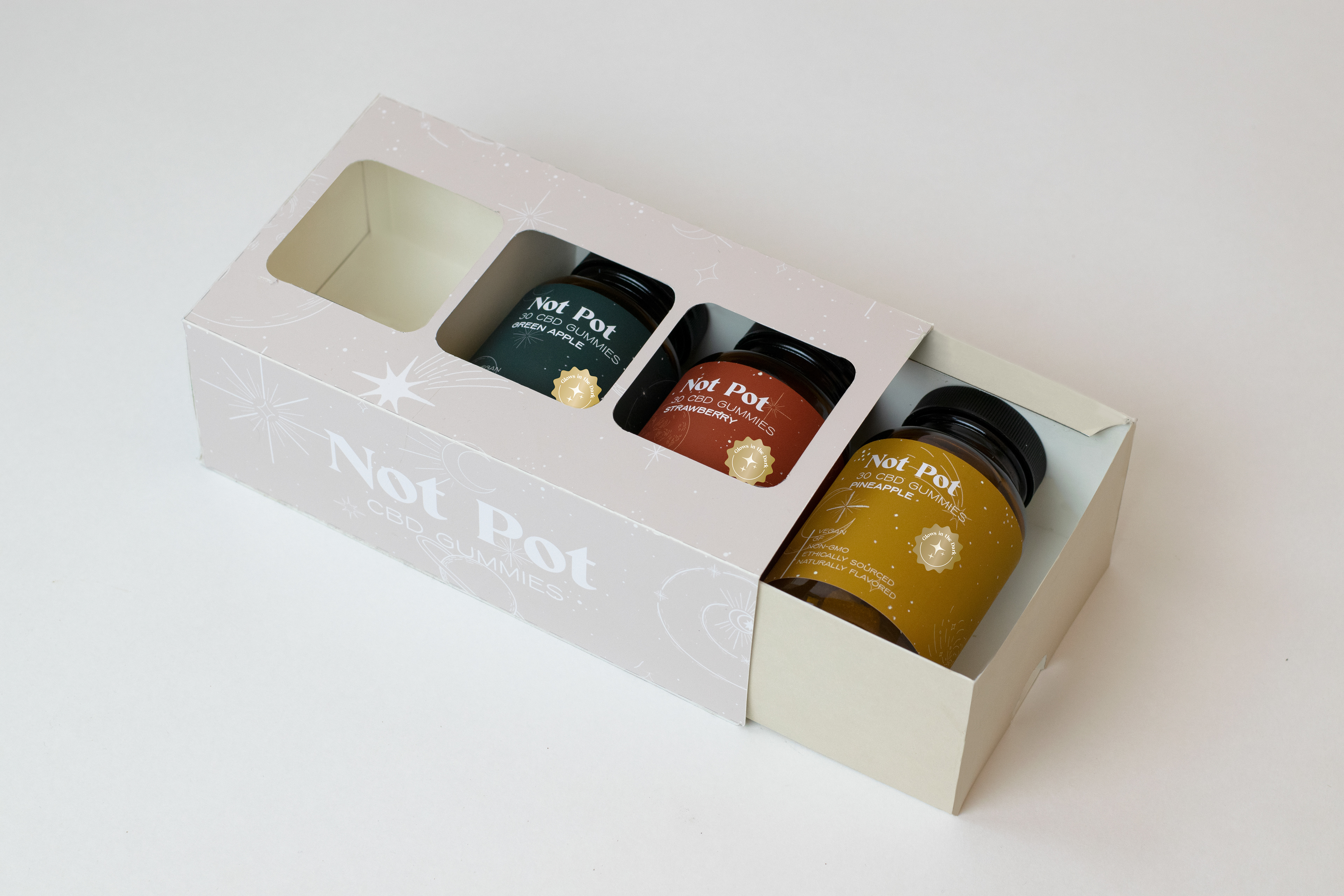
The glow in the dark aspect pf this packaging, while subtle, really packs a punch in consumer experience. Putting a smile on anyones face as a fun relaxing surprise.